


Redesign of Course Analytics & Creation Platform.


Project Type: Self-initiated UX/UI redesign
Role: UX/UI designer
Timeline: 3 weeks
The goal of this project was to redesign the core dashboard experience of a Course Intelligence SaaS platform to simplify decision-making, improve data visualization, and enhance overall UI clarity.
The focus was on transforming complex analytics into a more structured, intuitive, and actionable user experience.
Project Goal
Users need to quickly evaluate niche opportunities, but the current interface makes it challenging to identify the most important insights at a glance. The dense layout and limited visual prioritization reduce clarity and slow decision-making.
Problem Statement
Course Research Dashboard — Analysis & Redesign


1.

3.
2.
Issue: Dropdown filters (Niche, Topic, Platform, etc.) visually resemble static buttons rather than expandable menus.

Issue:
Metrics shown without clear business context.
Dashboard focused only on analysis without guiding users toward action.
Opportunity score lacks explanation.
4.
Issue
After analytics, users were immediately presented with a dense table of courses.
No strategic summary before detailed data.
Users had to manually interpret pricing, positioning, and revenue patterns.
What is Eurekaa.io?
Platform Type:
SaaS Market Research & Content creation Platform.
Target Audience:
EdTech creators, Udemy/Skillshare instructors, and digital coaches.
Core Value Proposition:
To de-risk course creation by providing data-backed validation of market demand and competition.
Improvement
Added a subtle directional arrow indicator to suggest the sidebar is expandable → Increases navigation clarity and reduces user uncertainty.
Redesigned the sidebar using a more neutral color scheme instead of high-contrast white on blue → the sidebar now supports the layout without dominating it, allowing key metrics and insights in the main area to remain the focal point.
Improvement
Refined filter components to follow standard dropdown patterns → Makes interactions more intuitive and reduces confusion.


Improvement
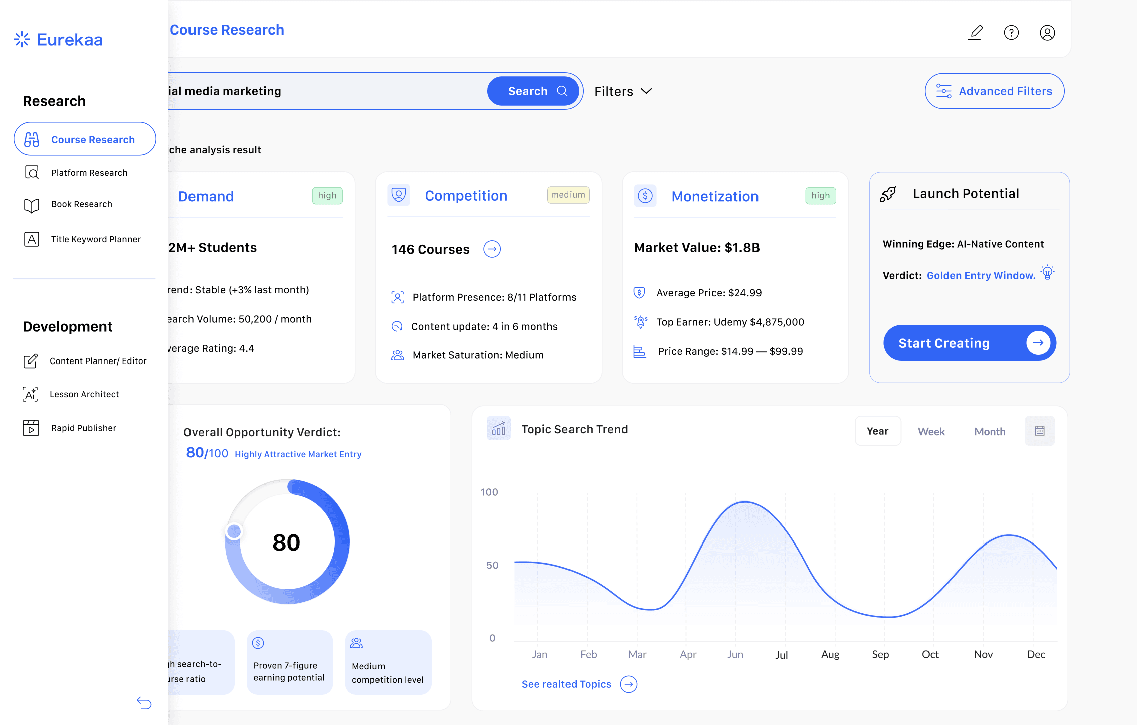
Introduced three structured decision cards:
Demand, Competition, and Monetization.
Each card groups related metrics and visually separates strategic dimensions of evaluation.
Added short contextual labels to clarify what each dimension represents.
To strengthen decision-making clarity, I introduced a new metric — Launch Potential
Added a contextual call-to-action → from passive analysis into an action-oriented workflow


To improve clarity, I introduced supporting summary cards below the score that briefly explain what the rating indicates and which key metrics contribute to it.
→ score more interpretable and increases trust by visually connecting it to its underlying data.
Improvement
Added a Competitor Landscape summary bar (price range, median rating, dominant platform) before the table.
Introduced a Key Insights section (Niche Gap, Strategy, Potential) → translates data into clear takeaways.
limited the table to the top five courses based on estimated revenue → helps reduce information overload and keeps the focus on the most relevant market players.
Positioned the CTA after insights → support natural progression.

After reviewing the dashboard analysis and competitor table, users can navigate to an individual course page for a more detailed evaluation.

Issue: The collapsible left sidebar expands only on hover, with no visual indicator that it is interactive.
The visual contrast is quite strong, and the icon styles lack consistency.

Before
After
Improvement
Reorganized scattered details into structured sections. → Faster scanning and easier decision-making.
Included revenue, ratings, learners, and sales chart → Helps users evaluate the course faster.
Improved spacing, hierarchy, and layout → Makes the page feel more modern and less overwhelming.
Added AI-based recommendation → Gives users direction, not just data.
Simplified and structured the module list → Faster content review and comparison.


From Descriptive Page → Analytical Evaluation Tool
Transformed a data-heavy dashboard into a decision-oriented evaluation tool
Clarified the meaning behind Opportunity Score through contextual explanation
Reduced cognitive overload by structuring metrics into Demand, Competition, Monetization
Added Launch Potential to convert analysis into action
Shifted the page from descriptive content to performance-based evaluation
Surfaced business-critical metrics (revenue, learners, growth trends)
Introduced strategic Market Gap insight to guide differentiation
Positioned AI analysis as a logical next step in the evaluation flow
Market Analysis Dashboard — Outcome
Course Analysis Page — Outcome
Project Timeline
Week 1:
Discovery & Expert Audit.
Heuristic evaluation of the existing platform to identify usability friction and data density issues.
Week 2:
Information Architecture.
Restructuring the core dashboard to prioritize "actionable insights" over "raw data".
Week 3:
High-Fidelity Design.
Developing the modern UI system, custom data visualizations, and the new brand-aligned color palette.
Expected Business Impact & Success Metrics
Faster Time-to-Insight: By replacing complex tables with clear insight blocks and a “Launch Potential” verdict, users can validate a niche up to 50% faster, making the platform more efficient and practical.
Lower Cognitive Load: Switching to standard UI patterns (dropdowns, clear navigation) reduces confusion and is expected to decrease support requests by around 30%.
Higher Activation & Conversion: Adding a clear “Start Creating” CTA right after a positive verdict encourages users to move from research to action.
Stronger Retention: Shifting the product from a “data tool” to a more strategic decision-making assistant increases its daily value and long-term usage.
Improved Market Positioning: A cleaner, more modern UI strengthens brand perception and helps position Eurekaa as a premium, easy-to-use solution compared to more cluttered competitors.
Problems in the Original Version
The page is text-heavy with weak visual hierarchy.
Key metrics (price, students, rating, revenue potential) were not visually prioritized.
AI analysis existed but felt detached from the user’s decision flow.
Hard to quickly evaluate whether the course is worth analyzing further.
Course Page — Analysis & Redesign